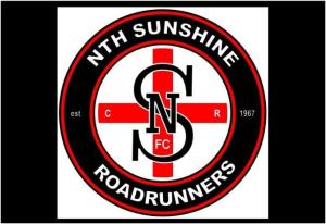
It seems it was out with the old and in with the new at Dempster Park, with the North Sunshine Football Club officially unveiling its new club logo.
Finishing the year in fifth place on the Division Three ladder with just one win, the club decided that a fresh start both on and off the field was needed for 2015.
Keeping with the original circle shape and red, white and black colouring, the new logo pays tribute to the club’s history, seeing the inclusion of the letters C.R signifying when the club was known to many as the Cross Roads Football Club.
Removing its roadrunner mascot from its former design, the club was able to incorporate traditional lettering, while also introducing a very clean cut look.
“The original idea was to keep the roadrunner in the logo and just jazz it up and have something fresh but it was difficult to come up with something that was going to appeal to everyone so we went a different direction and incorporated something that is unique while also mixing the old (crossroads) with the new,” club social media manager Matthew Mizzi said.
“We’ve received some really positive feedback from not only our own members, but the wider community which is great to hear.
“While there is still a lot of work to do, it’s great to see the club moving in the right direction and hopefully it's a start of a new era for the club.”
Last Modified on 25/11/2014 12:43